Case Study
The #1 trick to test & optimize landing pages with low number of conversions
“By obsessively optimising and testing our client’s landing pages, we stay far ahead of the majority of competition who’s still sending traffic to their basic websites.”
Simon - Cofounder/ CTO of Funnelsupply
Our core business is creating online lead generation funnels for our clients. Our optimization process relies on the daily input from tracking- and analytics tools. User behaviour analysis is especially useful when we are creating a new funnel for a new product or service from scratch and need to understand how a new audience behaves.
On our own Funnelsupp.ly landing page we continuously run tests and we wanted insights about which version of the hero section (above the fold) outperforms other versions. Since our homepage is basically a landing page, and we don’t get 100s of new leads per month, we don’t receive enough conversion data in order to base decisions on. The same goes for some of our Clinic clients who sell $1K+ treatments to consumers.
We started looking at KPI’s like session depth and session time in order to produce more data to work with. To achieve this we used Microsoft Clarity’s custom tags and segments. Thanks to this we have been able to test several hero sections and quickly double the performance of session depth and session time KPIs.
Also it allowed us to identify:
where on our own and our client’s landing pages users drop off;
what elements of pages users click on, of which we didn’t think they would need to be clickable;
what kind of headlines and subheadlines cause the users to stop scrolling for a longer time and which cause quick scrolling (session recordings);
How we increased landing click through for a clinic client
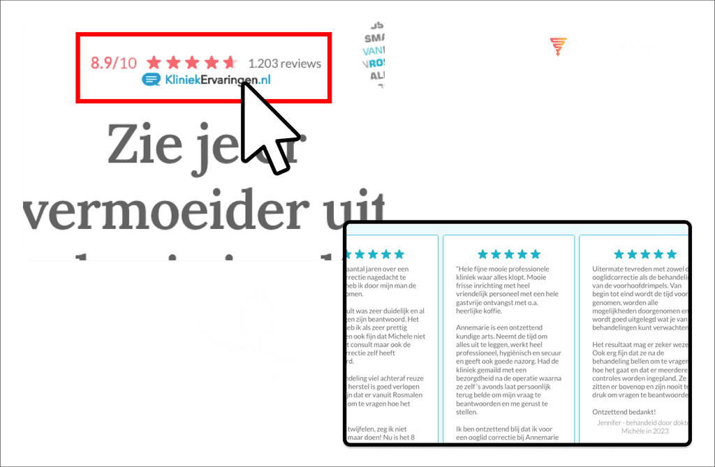
We found out that on one of our client’s landing pages, users tried clicking on an image of a 5 star-rating that was part of a social proof element. Thanks to this finding we have implemented custom behavior, showing users more testimonials after clicking the 5 star rating.
We made many changes to our own and our client’s landing pages along the way. To give an interesting example: we built landing pages and Google ads campaigns for a completely new service of one of our clients. We had to come up with everything from scratch and also find out the right price points for their service packages.
After initial setup and sending the first traffic from the ad campaigns, we noticed terrible CTR from the landing page to the lead capture form. With Microsoft Clarity we were able to very quickly identify drop offs and change the targeting of our ads accordingly. This already helped a bit performance wise. Then, by looking at session recordings, we also noticed a high drop off when users were looking at the pricing section of this landing page. We decided to isolate the pricing section as a second-step sub-page of this funnel, so we could further analyze which price points cause instant drop offs and which do not.
After only a week we were able to increase landing page CTR from around 4-5%, to more than 25%! At the same time we were able to feed the ad campaign algorithms with more useful click data, which resulted in even better performance. Because of Microsoft Clarity we were able to accomplish all this within a very short timeframe and reasonable ad budget. After a month total conversions were up 400% compared to the months before the changes. Another very happy client.

